
4·
2 days agoYou could at least make it easy and post a link to the pdf
You could at least make it easy and post a link to the pdf
What, like the pinned post on the smyths reddit page?

Windows 11’s Recall feature is on by default on Copilot+ PCs
Disabling the AI snapshotter requires a trip into Settings for ordinary users
Over the weekend, The Verge’s Tom Warren posted (on twitter) screenshots showing Microsoft’s latest Out-of-Box Experience (OOBE), in which the Recall feature can’t be turned off unless the user opens Settings after completing setup.
Now, it’s possible things have changed in the last few days, but I wouldn’t really expect them to based on the last time I used windows. I also didn’t know this before I tried looking it up, so I’ll admit I’m a little biased against microsoft.
But the real question is, what documentation are you looking at where you’re pulling all this information from? Can you provide a link?
You don’t understand why there’s so much fear, uncertainty, and doubt about an on-by-default program that records everything you do? Are you being serious right now?
I don’t know how to use this site. Samsung is a Korean company, so I look there, but I don’t see anything about samsung or phones. Clicking on “mach & elec” or “consumer goods” doesn’t seem to help either.
It’s not like netflix is the only one that can offer that kind of service. You’ve still got gamefly, 3D Bluray Rental, cafedvd, redbox (if you’re fine with going to a kiosk), your public library, and probably others if you care to search for them.

From that we can conclude that after an initial burst in death numbers, as covid and other viruses passes through the populace, death rates return to normal.
I mean, no, we really can’t. There’s not enough data available (that I’m willing to search for) to say for absolutely sure that excess deaths has increased and will stay high, but even just the snapshot you provided here shows that it’s slightly lower in January, and massively higher the rest of the year. Maybe the May 2023 data shows that the numbers are evening out compared to 2016-2019, but the one year we actually get to see shows way more excess deaths over the course of a year compared to before. You can’t just look at the most recent month, that’s not how yearly trends and averages work.
You won’t have much of an argument that the numbers are going back to “normal” until you’ve got closer to a full year’s worth of data with that excess deaths line being close to zero.
So if I’m understanding you correctly, you went from
you still have to account for the fact that covid might kill an old person that would otherwise die to influenza in a month or two
thinking covid wasn’t causing any/many additional deaths per year, just speeding them up a little
to providing a graph that shows thousands of extra people are dying each year
The increase of 2022 and 2021 was expected due to general decline of normal viruses (caused by covid measurements)
to saying all those extra deaths were because people weren’t getting sick from normal diseases, despite us not seeing much of a drop in 2020 from people not getting those diseases during the covid restrictions. But now that the restrictions are lifted and they’re being exposed to those normal diseases (and covid) again, all/most of theses extra deaths are from the normal diseases and have nothing to do with covid.
Norway absolutely did a better job at handling covid than the US, but the US’s death rate seems to just be permanently higher now as a direct result of covid. Maybe removing all restrictions was the right thing to do, but we shouldn’t ignore the fact that it comes at the cost of several thousand more people dying each year, just in Norway.
It looks like you’re getting the data from here (except the Norwegian language version), so I have to ask: is there a reason you’re cutting off the part of the graph showing “Deaths per 1000 mean population” spiking in 2022?

This new table is from here, and you can click “Choose variables” at the top if you want to see different data. But even just the graph you provided shows that total deaths for both sexes jumped up dramatically in 2022, the year you say covid restrictions were lifted. What are you trying to prove here exactly?
Even if I ignore you moving the goalposts, would you really look at a graph like this 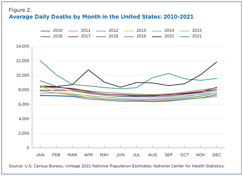
that’s a few years out of date and assume the total deaths settled back down into the old pattern?
I’m not finding a more up-to-date data source for deaths per month, but it’s not like you’re providing any kind of data that covid isn’t still killing a lot of extra people per year.
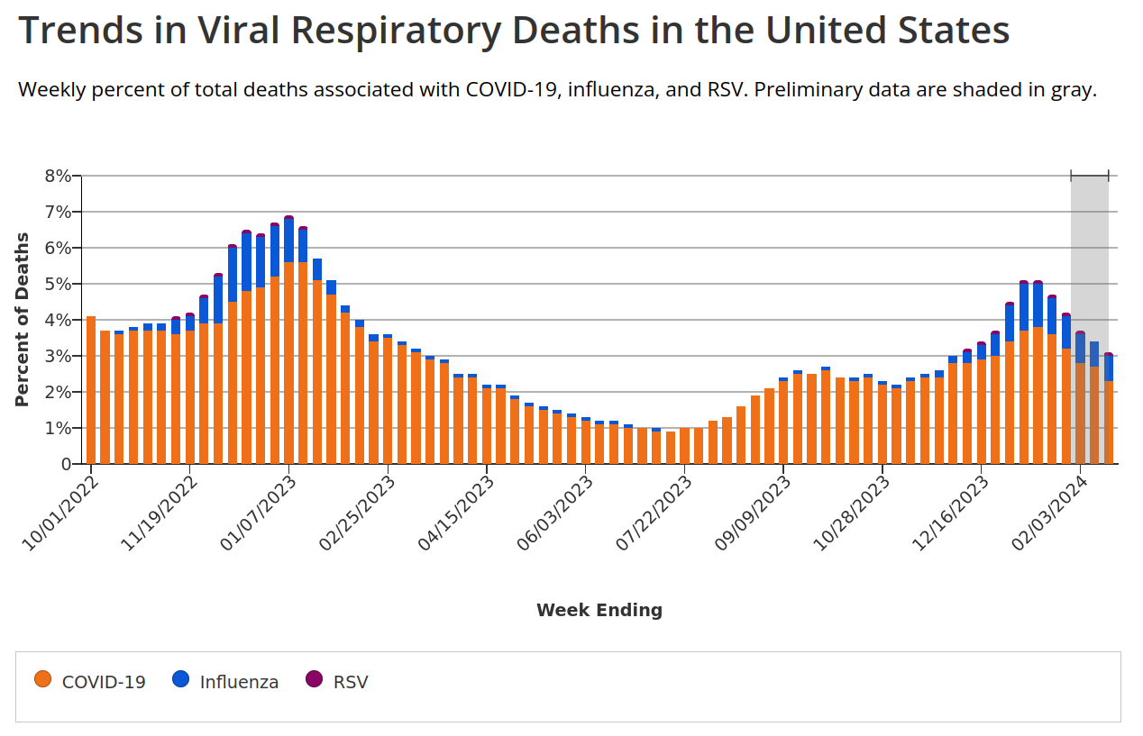
As many people die from covid as do from influenza or RSV at this point.
I understand you don’t feel affected by covid anymore, but you’re incredibly wrong.
CDC estimates for influenza deaths in the 2022-2023 flu season: 21,000
CDC cumulative covid deaths from Sep 9, 2023 minus Oct 1, 2022: 84,560
Honestly, I’m not seeing a death count for RSV, but based on this RSV Burden Estimates, it’s at most: 10,300 per year.
And this is all shown pretty well in the Trends in Viral Respiratory Deaths in the United States graph.


Not all of it, obviously. But if you want someone else to, you should consider not making them search through a different website to try to find it.